Chapter 1 Introduction and Example Datasets
Regression is one of the most flexible and widely-used tools for inferential data analysis. This book introduces the statistical method of linear regression, starting with simple linear regression and then expanding to multiple linear regression.
Example 1.1 At the Palmer research station in Antarctica1, researchers made measurements on three different penguin species: Adélie, Chinstrap, and Gentoo. The palmerpenguin R package (Horst, Hill, and Gorman (2020)) contains these measurements, which we will use in many of the examples. There are 342 measurements of penguins’ flipper length and body mass:
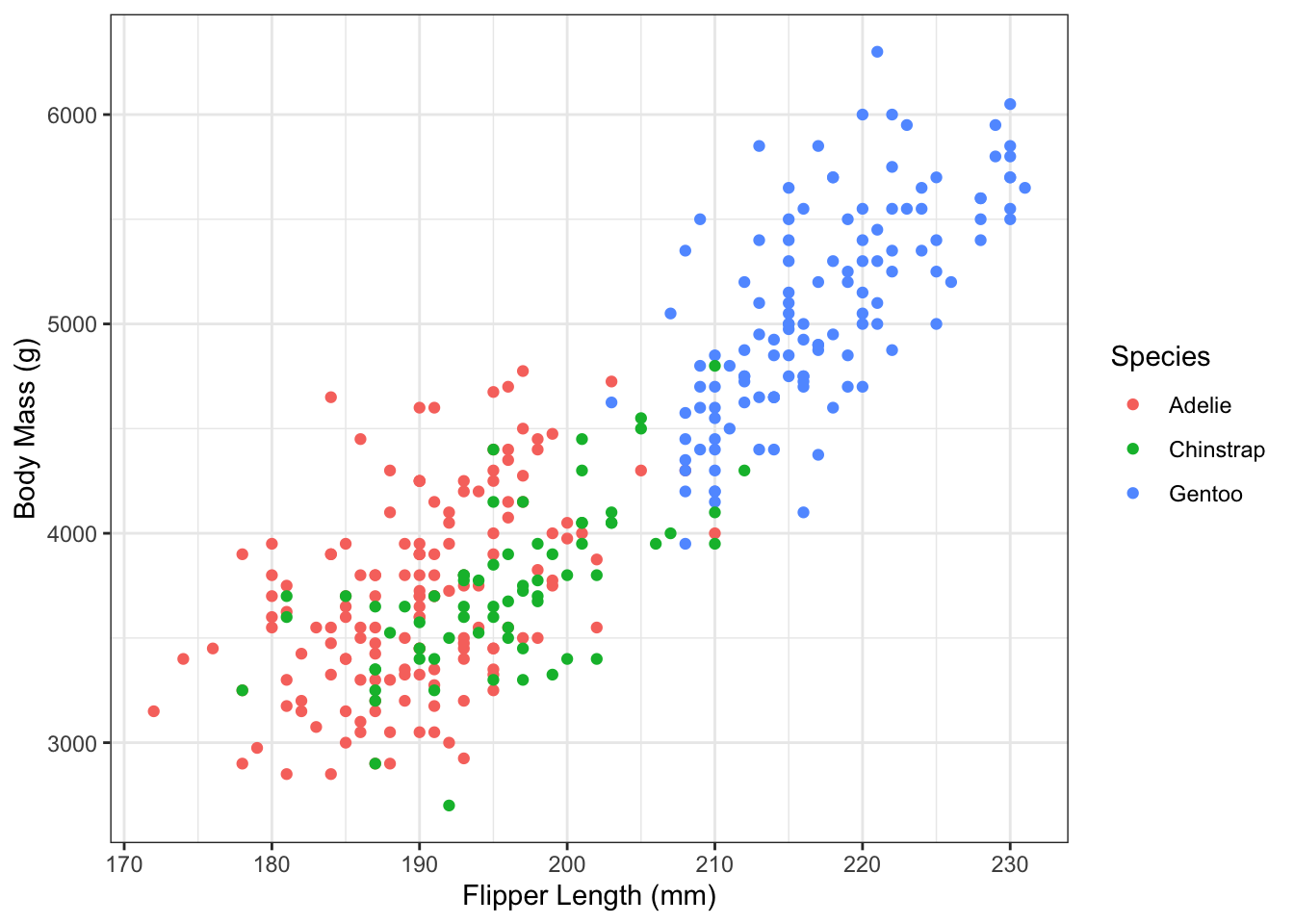
Figure 1.1: Flipper length and body mass in the Palmer Penguin dataset.
From Figure 1.1, there clearly seems to be a relationship between flipper length and body mass of the penguins. Can we quantify the size and strength of this relationship?
Yes! Using linear regression we can find the best fitting line through the data:
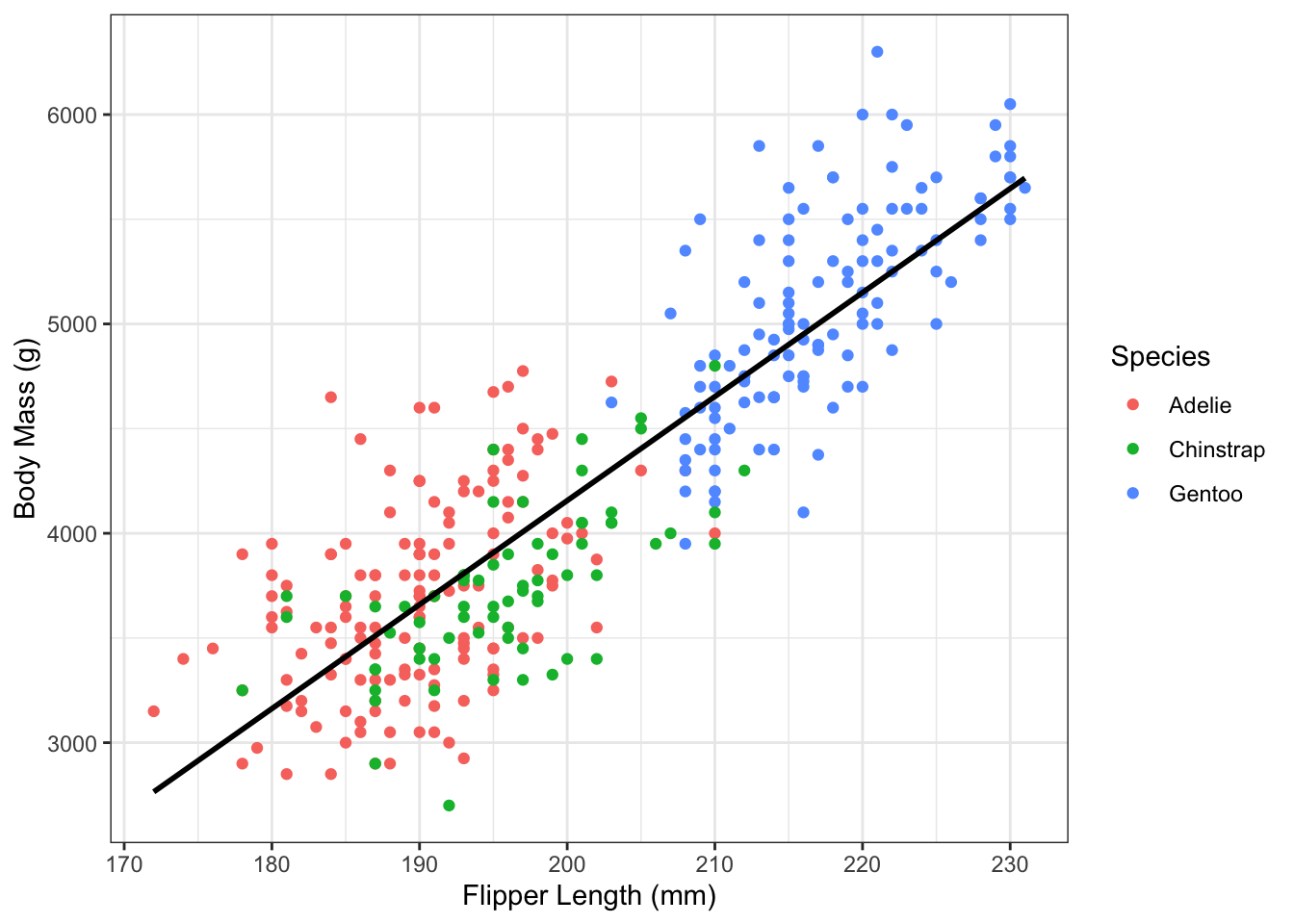
Figure 1.2: Flipper length and body mass in the Palmer Penguin dataset, with best fitting line.
The slope of this line tells us about the size and direction of the relationship between flipper length and average body mass. We can also estimate the amount of uncertainty in the intercept and slope of the line.
1.1 What is regression?
Finding the best fitting line in Figure 1.2 is an example of simple linear regression, which is a statistical method for explaining variability in an one quantity (e.g. penguin body mass) using variation in a different quantity (e.g. penguin flipper length).
More generally, regression is a statistical method for explaining variability in an outcome variable (other names include: dependent variable, response variable) using variation in one or more predictor variables (other names include: independent variable, covariate, explanatory variable, regressor).
In linear regression, the outcome variable is always a continuous variable, meaning that it takes on any numerical values. The values might be only over a specific range (e.g. body mass is necessarily greater than zero) and have a limited precision (e.g. body mass is only measured out to a certain number of decimal places). If the outcome variable is binary (e.g. sick/healthy) or categorical (e.g. species), then a different type of regression model is needed. This book will focus primarily on linear regression, but we will cover other types of regression in Chapters 18 and 19.
On the other hand, the predictor variables can be almost any type, whether continuous or categorical. In Simple Linear Regression (Chapters 2 through 7), there is only one continuous predictor variable. But in its general form, Multiple Linear Regression (Chapter 8) can include an arbitrary number of parameters. The predictors can be any combination of variable types, including interactions (Chapter 11) and non-linear transformations (Chapter 14).
1.2 Regression Goals
We can describe the goals of regression in two ways: the scientific goals and the practical (mathematical) goals.
1.2.1 Scientific Goals
The scientific goals of regression are: description, inference, and prediction.
The descriptive goal of regression is focused on showing the relationship between \(x\) and \(y\). Emphasis is on quantifying and visualizing the relationship, rather than on drawing specific conclusions. Descriptive goals are inherently exploratory, and don’t always require a specific question. Sometimes, we have data on an entire population, in which case the goal of the analysis is about describing relationships rather than making inference for a larger population.
One of the fundamental goals of statistics, and one that sets it apart from other data science fields, is inference. Inference takes a descriptive analysis one step further, and uses information about uncertainty to quantify the strength of a relationship. In short, inference is used to answer the question: Is there a relationship between \(x\) and \(y\), beyond what we would just expect by chance? Fundamental tools in statistical inference are confidence intervals and hypothesis testing. Inferential goals are also sometimes called association goals, since the objective is to learn about an association (or lack thereof) between variables.
A third, and fundamentally different, goal of regression analysis is prediction, when we want to predict values of \(y\) for new observations using their value of \(x\). Prediction is the primary goal in the area of statistical (machine) learning, and regression is only one of many tools that can be used to make predictions for a dataset. This book covers prediction in Chapter 16.
Example 1.2 Consider the following questions using the penguin data in Figure 1.2:
- Descriptive: What is the shape of the relationship between flipper length and body mass?
- Inferential: Is there a relationship between flipper length and average body mass in penguins?
- Prediction: What is the predicted body mass for a penguin with 200mm flippers?
- Inferential: What is the estimated differences in body mass between penguins who differ in flipper length by 50mm?
1.2.2 Mathematical Goals
The mathematical goals goals of regression are what we need to accomplish to achieve our scientific goal (regardless of whether that is description, inference, or prediction). Visually, the goal of linear regression is to find the best fitting line for the \(y\)’s. In later chapters, we will see how to generalize this to any nonlinear function. Mathematically, we do this by estimating parameters and their uncertainty.
1.3 Example Datasets
Throughout this book, we will make repeated use of several example datasets, which we now describe.
1.3.1 Palmer Penguins (Part 2)
Example 1.3 Other values in the Palmer Penguins dataset include penguin sex and measurements of bill depth. The following histograms show the distributions of bill depth by sex:
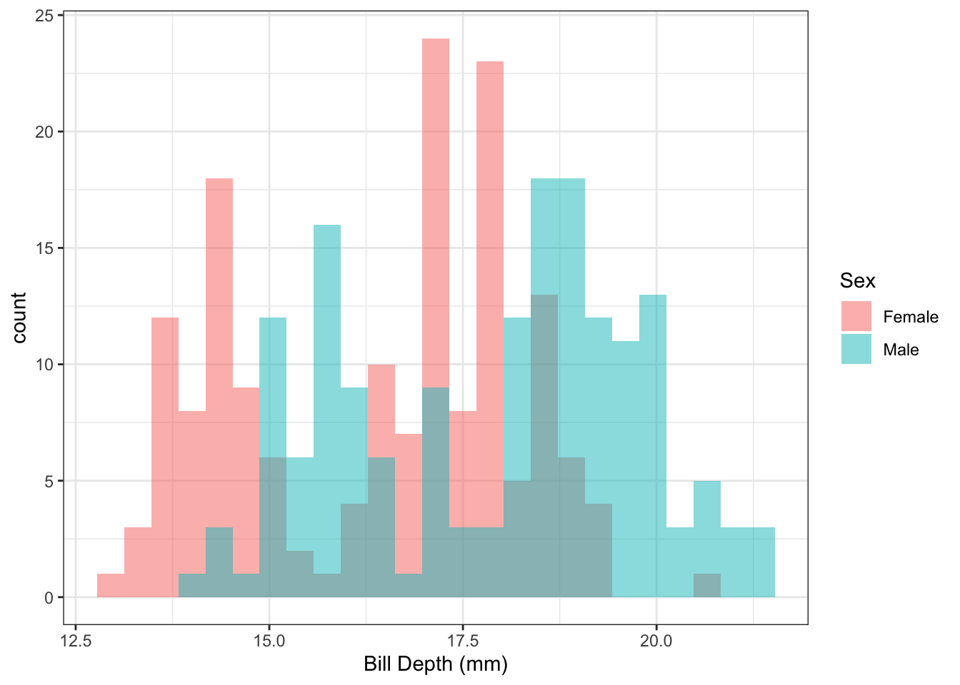
Figure 1.3: Distribution of penguin bill length by sex.
In Figure 1.3, it appears that there might be a difference in the average bill length by sex. We can use linear regression to quantify this difference.
Example 1.4 The following histograms show the distributions of bill depth by species:
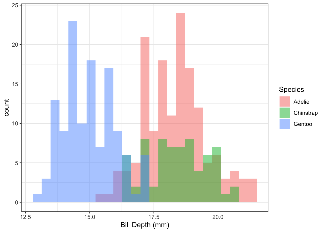
Figure 1.4: Distribution of penguin bill length by species.
Q: It looks like there might be a difference in the distributions of bill length by species. Can we quantify this?
A: Yes! Using linear regression, we can estimate the difference in mean bill length between the three penguin species.
Example 1.5 Figure 1.5 shows the distribution of bill length by species and sex.
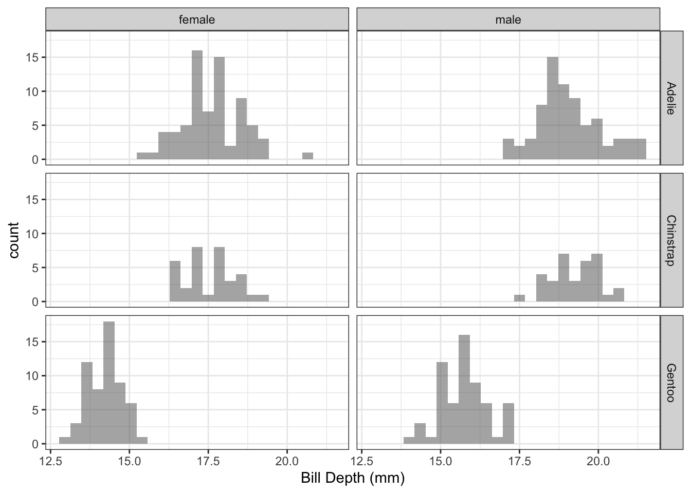
Figure 1.5: Distribution of penguin bill length by species.
Q: It looks like there might be a difference in the distributions of bill length by both species and sex. Can we quantify this?
A: Yes! Using linear regression, we can estimate the mean bill length for all possible combinations of sex and species.
1.3.2 Baseball Hits
More so than almost any sport, baseball is full of statistics. While traditional statistics such as batting average and earned run average have long been collected, the tracking systems in modern baseball stadiums allow a plethora of information to be collected for each batted ball.
Example 1.6 Figure 1.6 shows all of the balls in play from the Colorado Rockies in the 2019 season. Along the horizontal axis is the launch speed, which is the speed at which the ball left the bat when hit. The vertical axis shows the distance the ball traveled. The color of each point shows whether the batted ball resulted in a hit or an out.
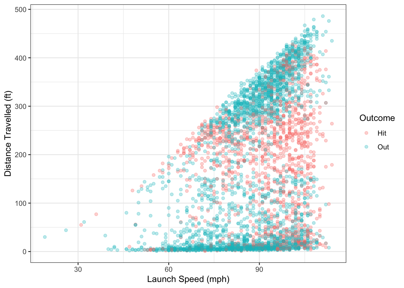
Figure 1.6: Distance travelled and launch speed for balls in play from Colorado Rockies in 2019.
There are several questions we could ask using the data from Figure 1.6:
- Is there a relationship between launch speed and hit distance? If yes, can that relationship be quantified?
- For a ball hit at 90 mph, what is the predicted distance traveled?
- Using launch speed, can we predict whether or not a batted ball will result in a hit or an out?
Example 1.7 Another variable that is measured is the launch angle of balls in play, which is the angle (in degrees) that the ball leaves the bat. A launch angle of 0 means the ball was hit straight out; a positive angle means it was hit up in to the air and a negative angle means it was hit down into the ground.
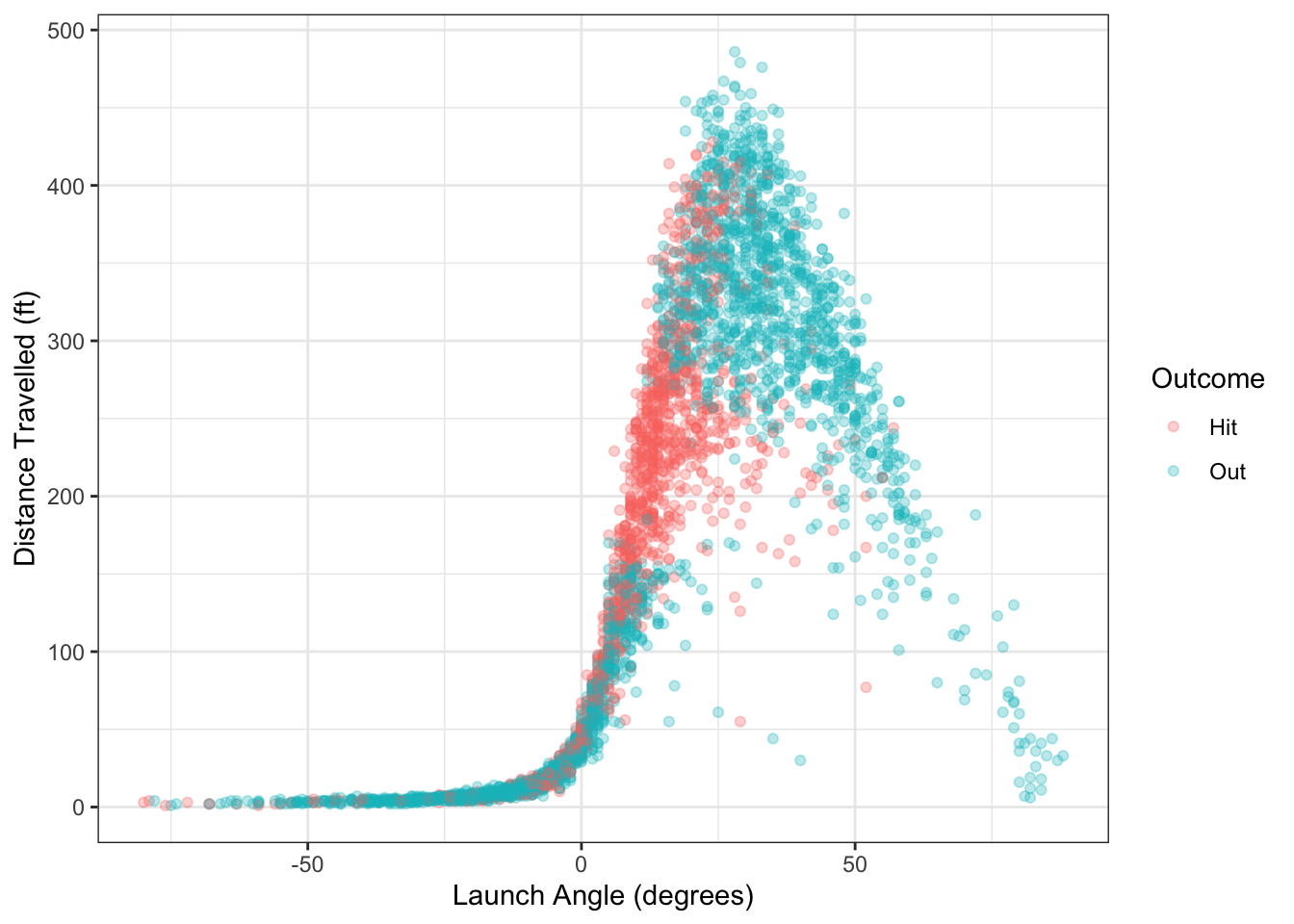
Figure 1.7: Distance travelled and launch angle for balls in play from Colorado Rockies in 2019.
There are several questions we could ask using the data from Figure 1.7:
- Is there a relationship between launch angle and hit distance? If yes, can that relationship be quantified?
- For a ball hit at 45 degrees, what is the predicted distance traveled?
- Using launch angle, can we predict whether or not a batted ball will result in a hit or an out?
1.3.3 Housing Price
Many factors impact housing prices, perhaps most importantly the economic demographics of the region. Zillow, the online real estate company, maintains a public database of housing-related data at https://www.zillow.com/research/data/. Combining this data with demographic information from the Census can let us analyze different housing trends.
Example 1.8 Figure 1.8 shows data from Zillow on the median price for a single-family residence in January 2018 in different metropolitan areas across the U.S. On the horizontal axis is the 2018 median household income for the area, taken from the U.S. Census’ American Community Survey.
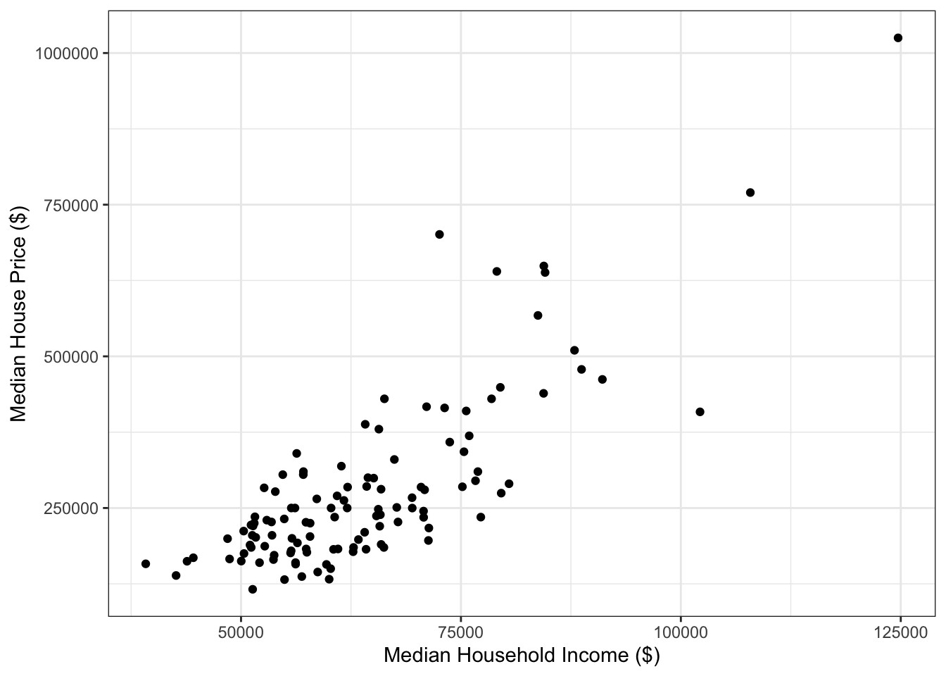
Figure 1.8: Median single-famly residence prices and annual income in U.S. metropolitan areas.
In Figure 1.8, there seems to be a relationship between median house price and median annual income. One question we might ask is, how robust is the relationship to removing the outlier point in the top right? The data for Figure 1.8 can be downloaded here: housing_income.csv.
1.3.4 Bike Share Programs
A bike sharing program recorded meteorological factors as part of efforts to understand factors related to bike usage on weekdays. A subset of this data is plotted in Figure 1.9
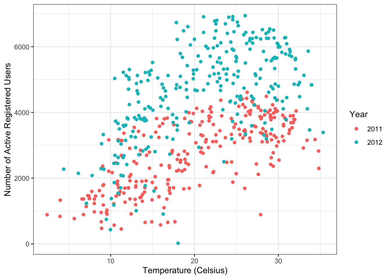
Figure 1.9: Bike sharing data.
It looks like there is a positive relationship between temperature and the number of active bike users. There also appears to be a year effect, with more users in 2012 compared to 2011. Can we use temperature, year, and other factors such as humidity and windspeed to predict the number of users active for a given day?
1.3.5 Car fuel efficiency
The ggplot2 package contains the mpg dataset on fuel efficiency for vehicles from 1999-2008. Figure 1.10 shows the relationship between displacement and city miles per gallon.
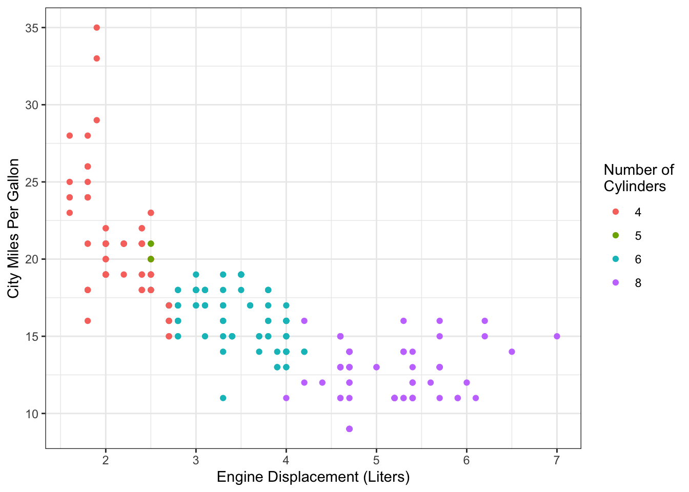
Figure 1.10: Fuel efficiency data from mpg dataset.